

rooted in Japanese tradition.
rooted in Japanese tradition.


discovering an inner balance.
A big part of branding is what's in the name.
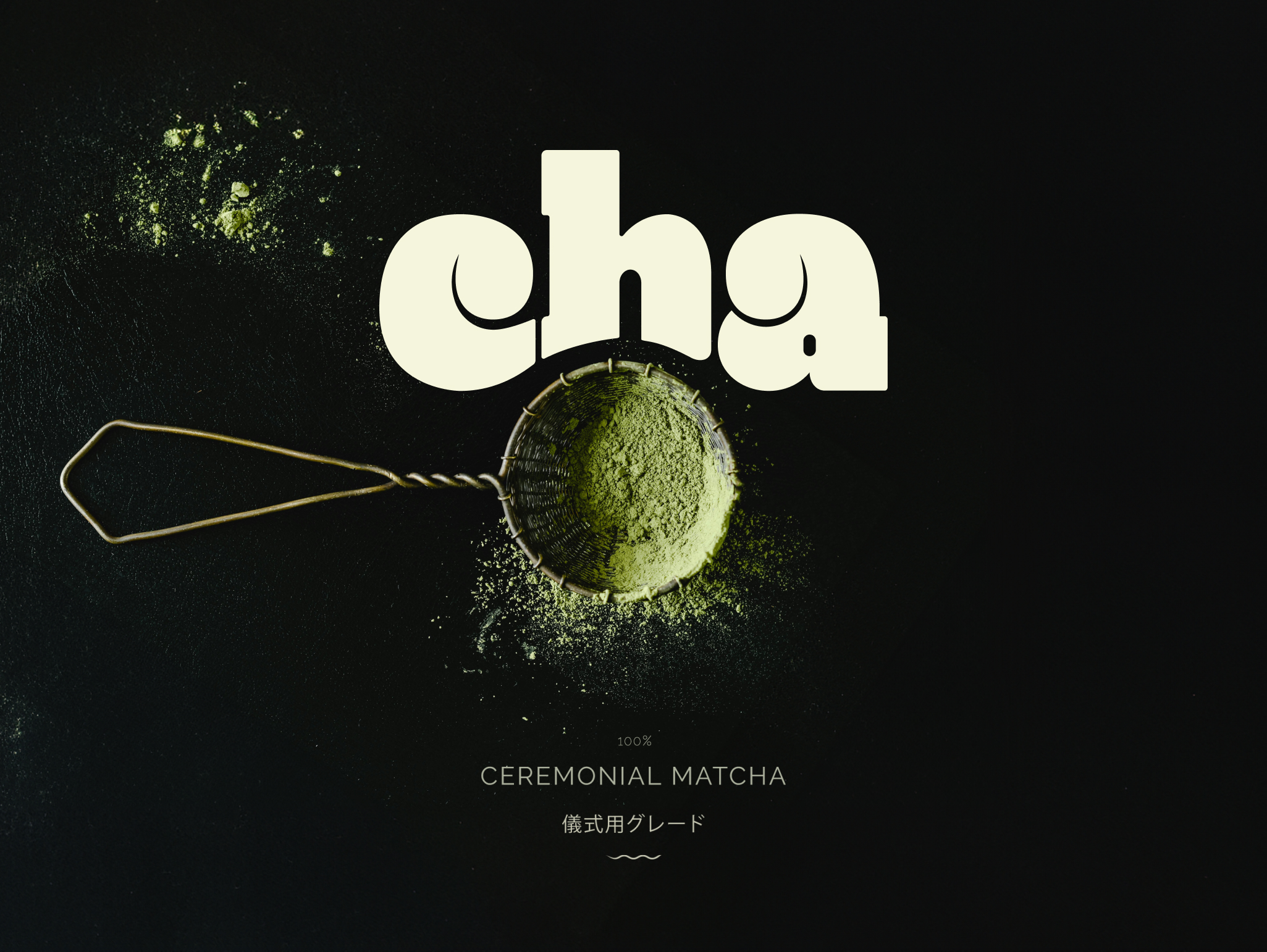
The word Cha means tea in Japanese. It’s minimal, direct, and carries the full weight of tradition in just three letters. A name that honors where matcha comes from—without over-explaining what it is.
Cha’s messaging is built on clarity, not hype. The tone is warm, minimal, and honest—designed to feel like a deep breath, not a sales pitch.
Positioned for a discerning audience that values balance and quiet luxury, the brand invites connection through simplicity. Every touchpoint reflects this: the name, the voice and messaging, the packaging—it’s all built to hold space, not fill it.
respect the ritual.


a mindful identity.
At the heart of Cha’s visual identity lies the principle of balance.
The custom logo merges ancient character with subtle playfulness, inspired by the art of stone balancing—a symbol of ritual, stillness, and clarity.
An earth-toned palette paired with modern typography reflects Cha’s values: sustainability, intention, and emotional presence. Here, nothing is superfluous; everything is intentional.

form follows ritual.
The packaging design mirrors the brand’s ethos of balance and restraint.
We selected matte, compostable pouches that are as pleasing to touch as they are to behold—modern, minimal, and sustainable.
Clean lines, soft textures, and deliberate printing techniques coalesce to create a tactile experience that honors the ritual of matcha.
Interested in creating a brand that resonates with mindfulness and intentionality? Let’s work together to bring your vision to life.
“drink your tea slowly and reverently, as if it is the axis on which the world earth revolves.”